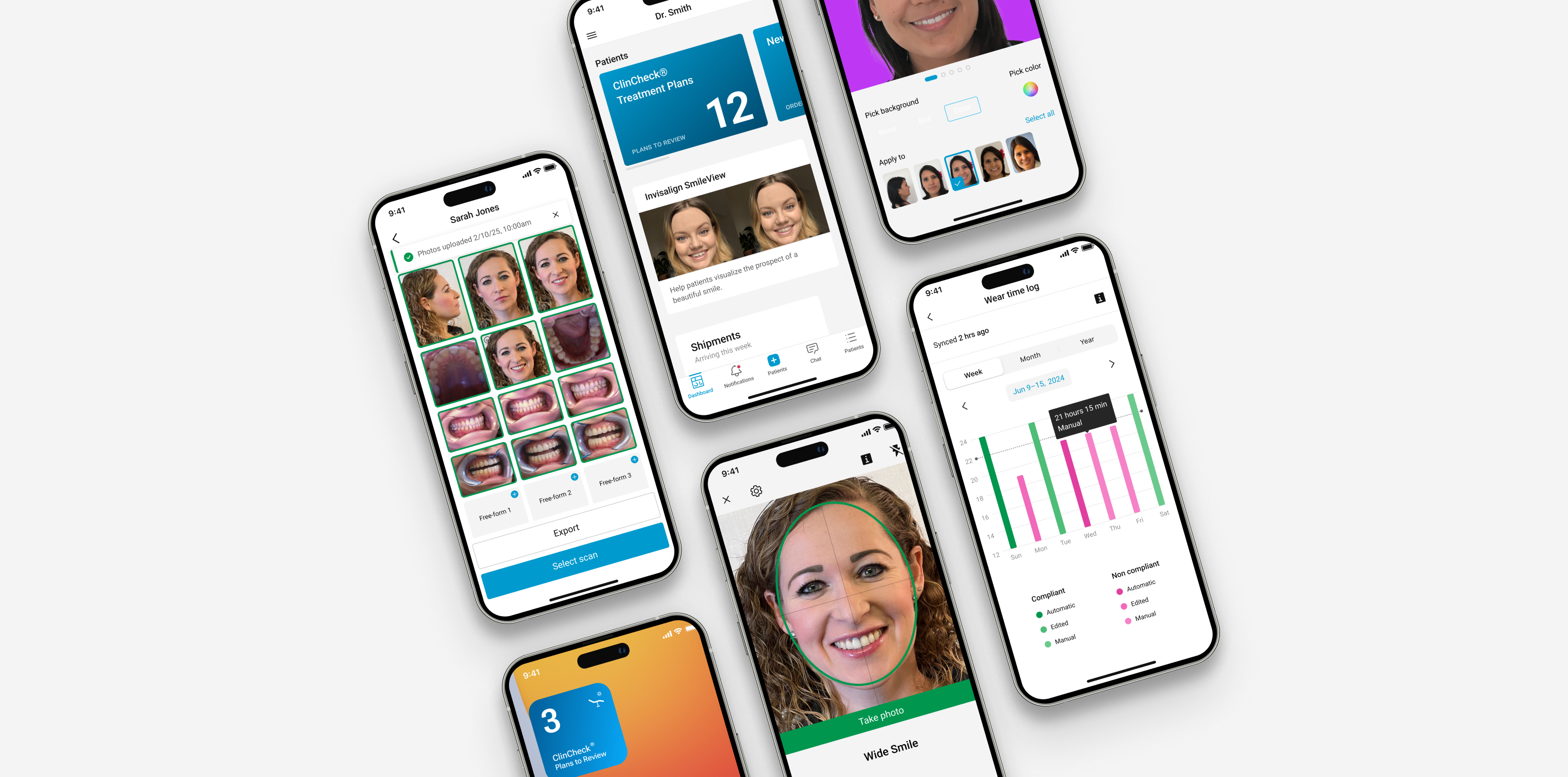
Decision #1: Today-first navigation, not camera-first
The choice:
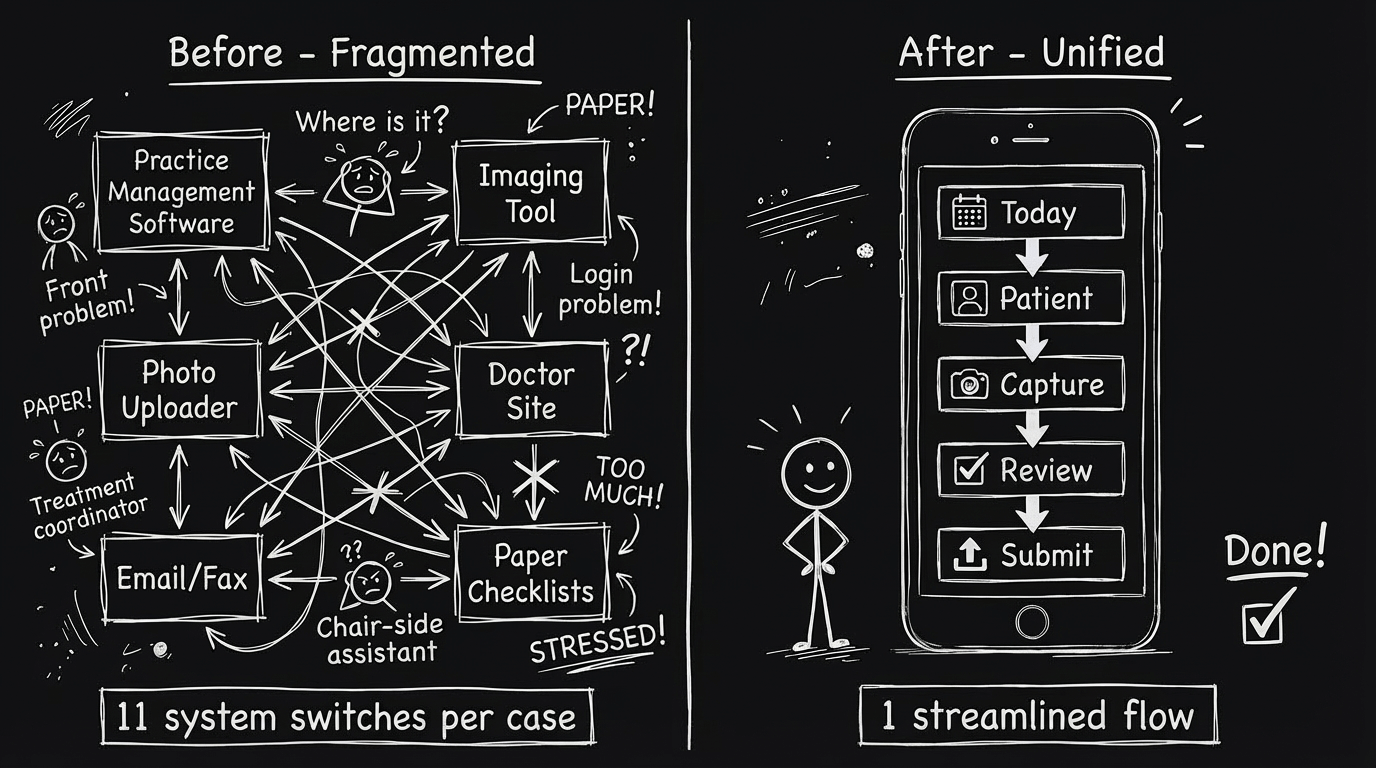
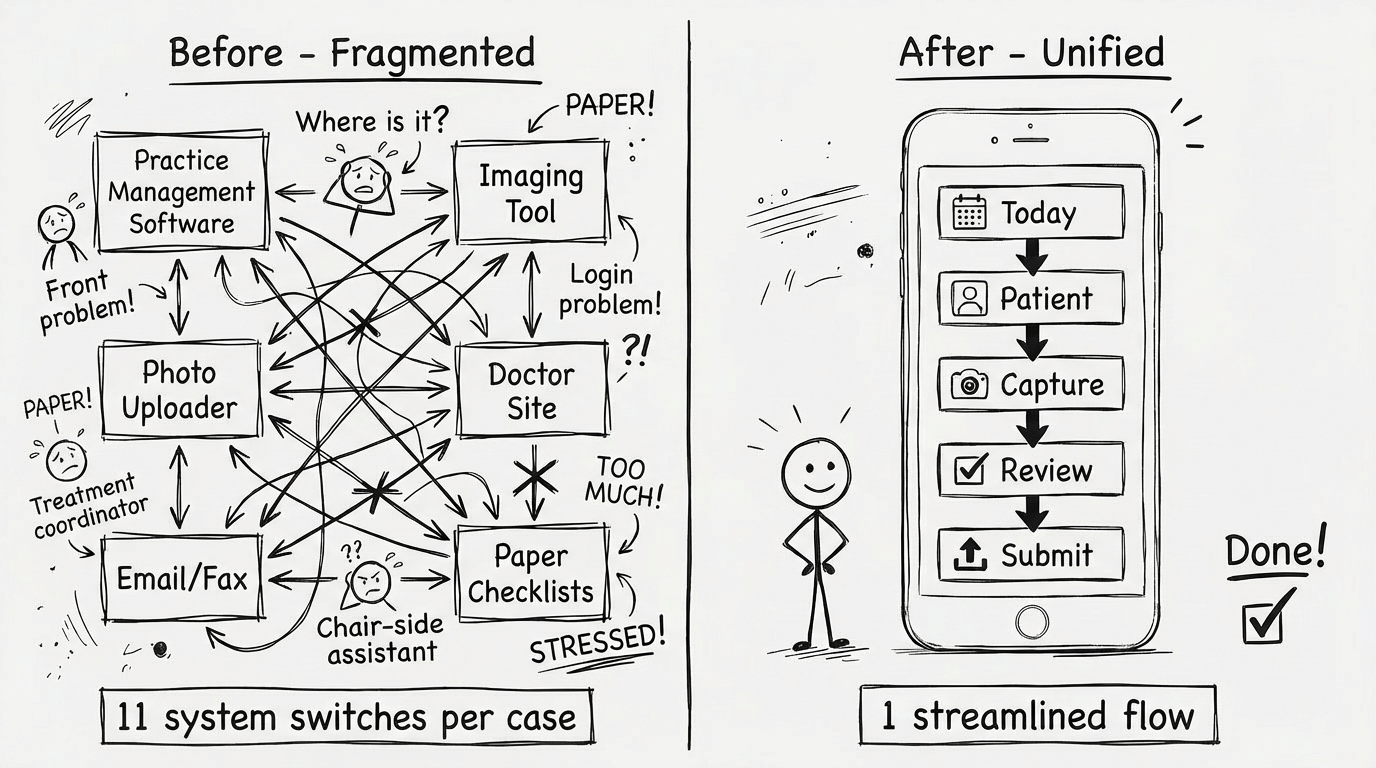
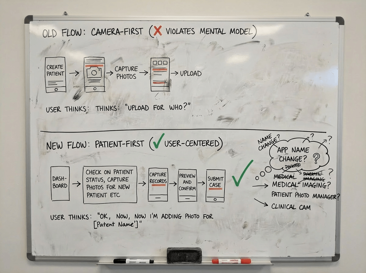
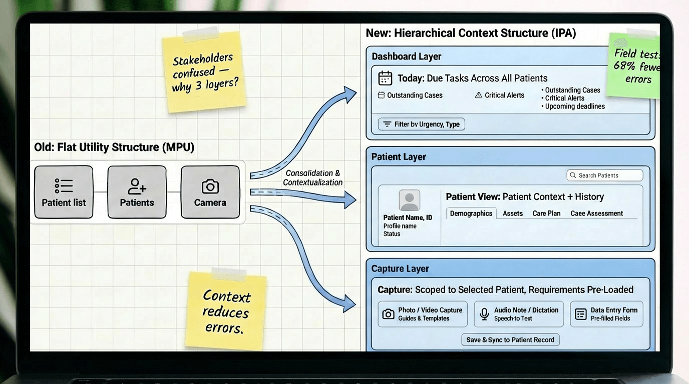
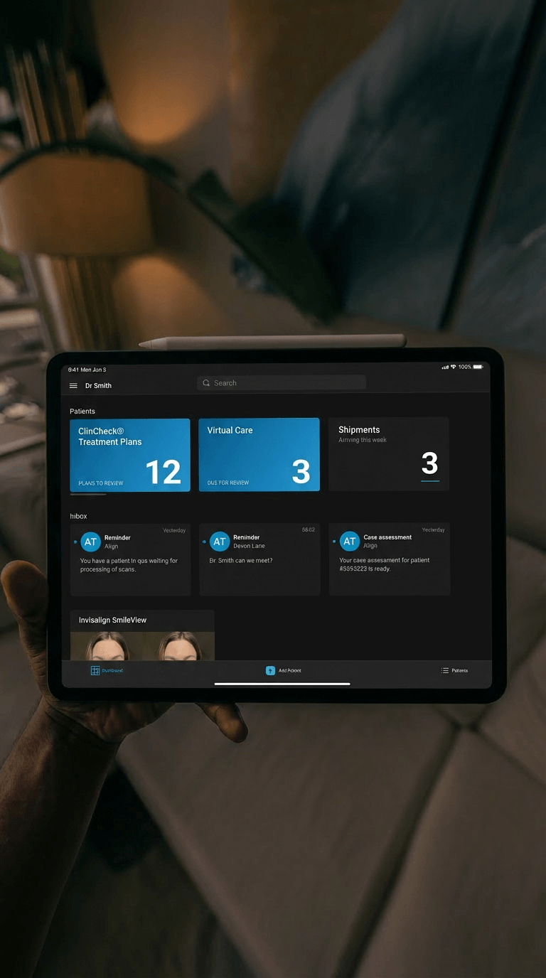
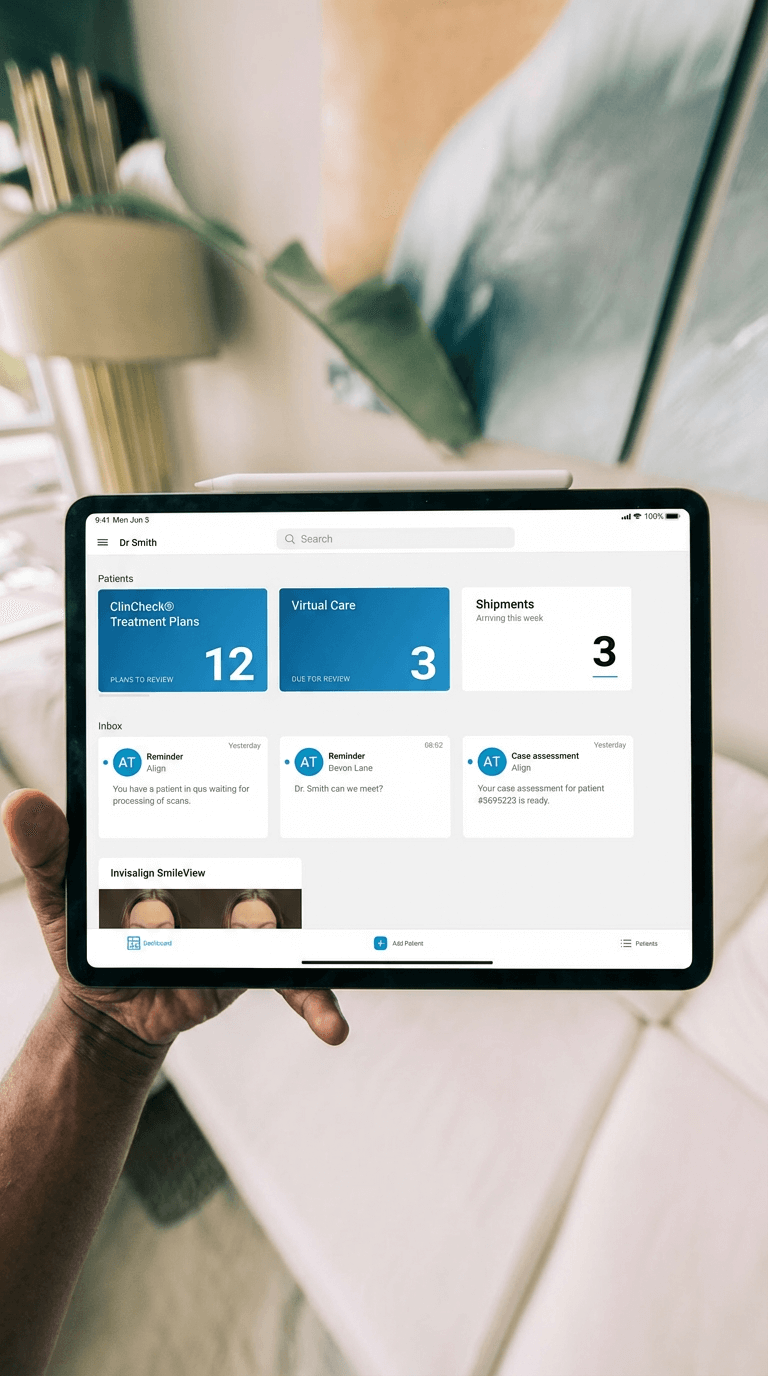
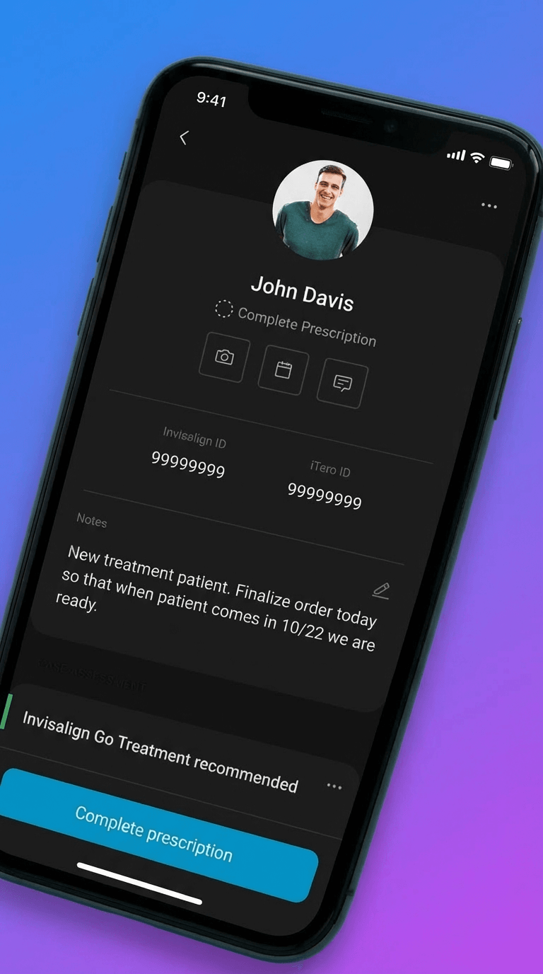
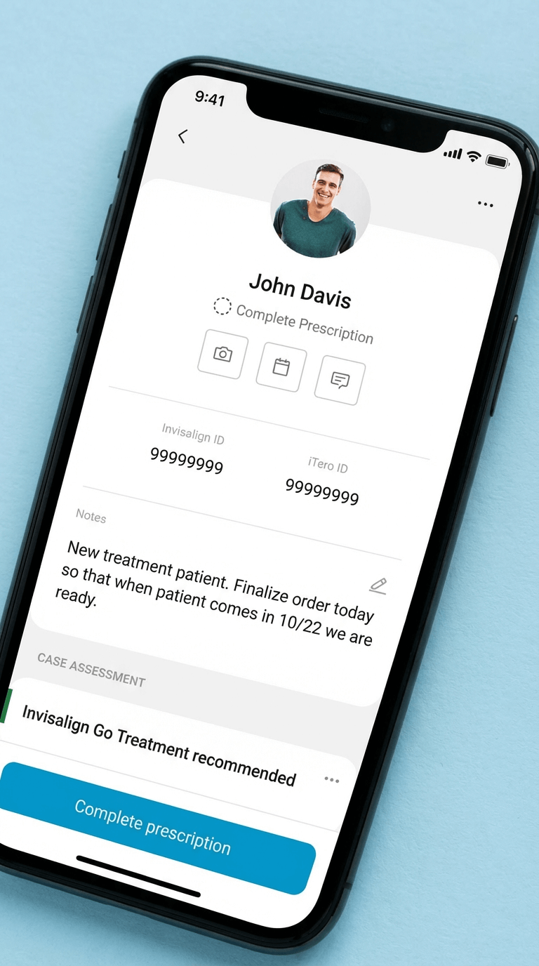
Restructure the entire app around "Today → Patient → Capture" instead of keeping the existing "Camera → Photo type → Assign patient" flow.
Why:
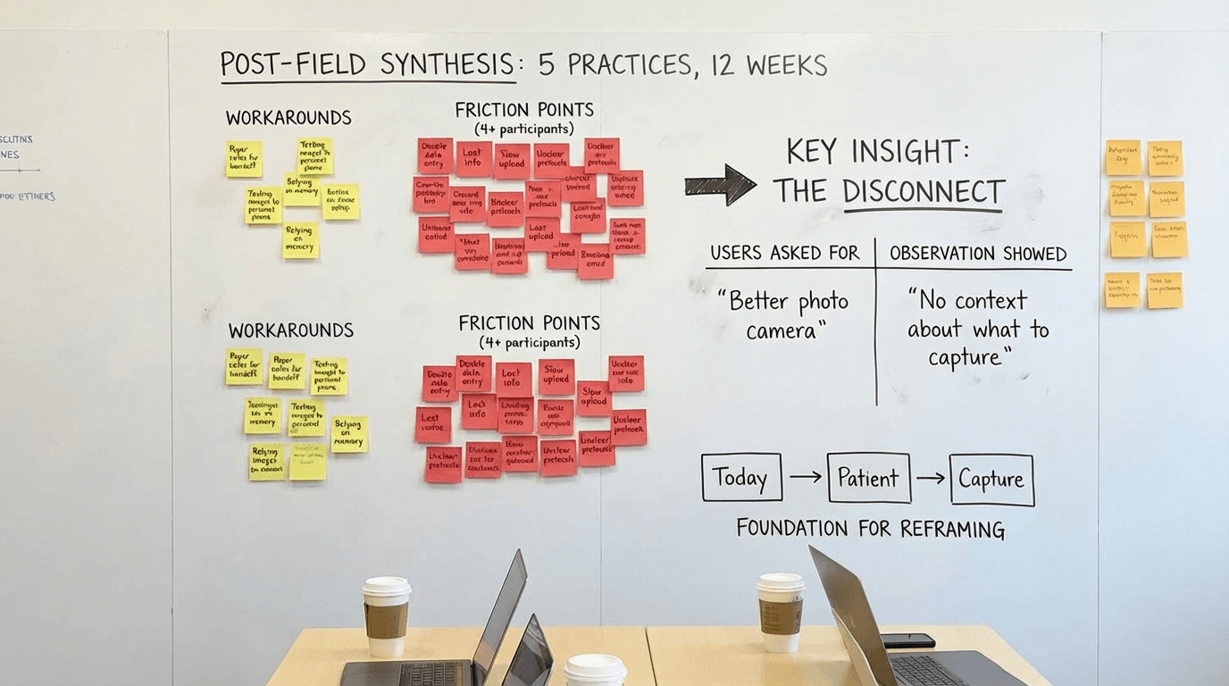
Field observation showed users spent 40+ seconds per task checking external systems for patient context before opening the camera-first app. They thought in "patient tasks" not "photo tools." The camera-first structure optimized for the tool instead of the job. Reframing around patient context reduced task completion time by 52 seconds and eliminated the "check notes, open app, return to notes" loop.
Tradeoff:
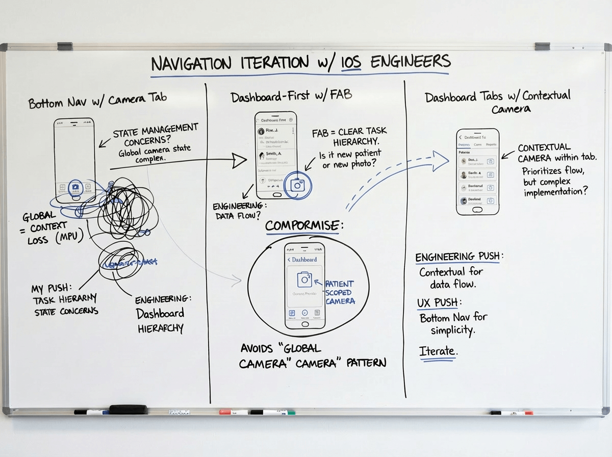
Deeper navigation hierarchy. Users now needed 2-3 taps to reach the camera instead of 1. But those taps were contextual—Today → select patient → see what's needed → capture—which proved faster overall because users knew what to do at each step. We mitigated extra taps by adding quick-capture shortcuts for power users (swipe action on Today items).
Alternative we rejected:
Hybrid approach with both camera tab and Today tab as equals. Tested in prototypes but created confusion—users didn't know which path to take and often picked the wrong one. Having two equal paths to the same outcome doubled cognitive load. We chose a single primary path (Today-first) with camera as a patient-scoped tool, not a top-level feature.
Decision #2: Permissions-based access, not role-customized UI
The choice:
Give all users the same interface with backend permissions controlling feature access, rather than customizing the UI based on selected role.
Why:
Small practices had one person covering all roles. Role-customized UI meant users couldn't see features they needed when wearing different hats. Support tickets about "missing features" spiked 3x after role-based customization. Flexible role coverage in practices didn't match rigid software roles. Permissions-based approach matched practice reality—everyone sees the same interface, but practice admin controls who can actually use which features.
Tradeoff:
Users sometimes saw features they couldn't access (grayed out with permission message). This felt like poor design to stakeholders. But field testing showed users preferred seeing-but-disabled over feature invisibility—they could understand their access level and request changes from admin. When features were completely hidden, users assumed the app "didn't have" that capability. We added permission explainers ("This feature requires Doctor role. Contact your practice admin.") to make access clear.
Alternative we rejected:
Smart role detection that dynamically showed/hid features based on inferred user behavior. Engineering proposed this as a compromise. We rejected it because: (1) behavior-based inference was unreliable and would create unpredictable UI, (2) users would lose trust if features appeared/disappeared mysteriously, (3) complexity would create support nightmares. Explicit admin-controlled permissions were more transparent and predictable.
Decision #3: Offline-first architecture, not online-first with offline fallback
The choice:
Architect all core workflows to function fully offline with background sync, rather than building for online-first with offline as an edge case.
Why:
Field deployment revealed 30-40% of operatories had unreliable connectivity. In one pilot practice, 6 of 12 exam rooms lost connection multiple times daily. Teams couldn't trust online-first apps for critical workflows because work would be lost. Adoption stalled at 31% in pilot cohort. Offline-first architecture meant core workflows (Today, Patient, Capture, Review) worked regardless of connectivity. Post-pivot adoption jumped to 87% in the same cohort.
Tradeoff:
Significant engineering complexity and 4 months added to roadmap. Data sync conflicts, version reconciliation, and local storage management became major technical challenges. We also had to handle scenarios where users made conflicting edits while offline. Chose last-write-wins with conflict notifications rather than complex merge logic. Some data staleness was inevitable—Today view might show slightly outdated task lists until sync completed. We added visual indicators (amber dot = sync pending, green = synced) to manage expectations.
Alternative we rejected:
WiFi requirement with upfront warning and setup assistance. Engineering and product team proposed requiring WiFi before use to avoid offline complexity. I pushed back hard: connectivity wasn't something practices could easily fix (structural/institutional constraints), and requiring it would exclude our most important users—high-volume practices with imperfect infrastructure. We chose to own the complexity so users didn't have to change their building or workflow.
